
Smart Response
Turning a Long Onboarding Survey into a Finishable Workflow
Led the redesign of Smart Response’s dashboard and multi-step onboarding survey, helping non-technical users navigate complex information and complete profile updates with less friction.
01 At a Glance
- Role
- Senior Product Designer
- Timeline
- 12 weeks
- Team
- PM · Engineering · Operations
- Ownership
- End-to-end redesign · Product strategy · UX research · Information architecture
- Outcome
- ~26% higher survey completion
- ~15% faster task completion
Measured in usability testing.
Overview
Smart Response helps donors discover verified nonprofit organizations responding to disasters. To appear on the platform, organizations complete onboarding surveys that determine how they’re represented to potential donors.
As Smart Response migrated from Angular to React, what began as a survey redesign evolved into a complete redesign of the onboarding experience.
02 The Challenge
The original request was straightforward: redesign three onboarding surveys
Step visibility wasn’t the problem. Users could see Step 3 of 7 and Question 4 of 5. What they lacked was a usable sense of progress across the onboarding workflow: what was complete, what still needed attention, how much work remained, and where to resume later.
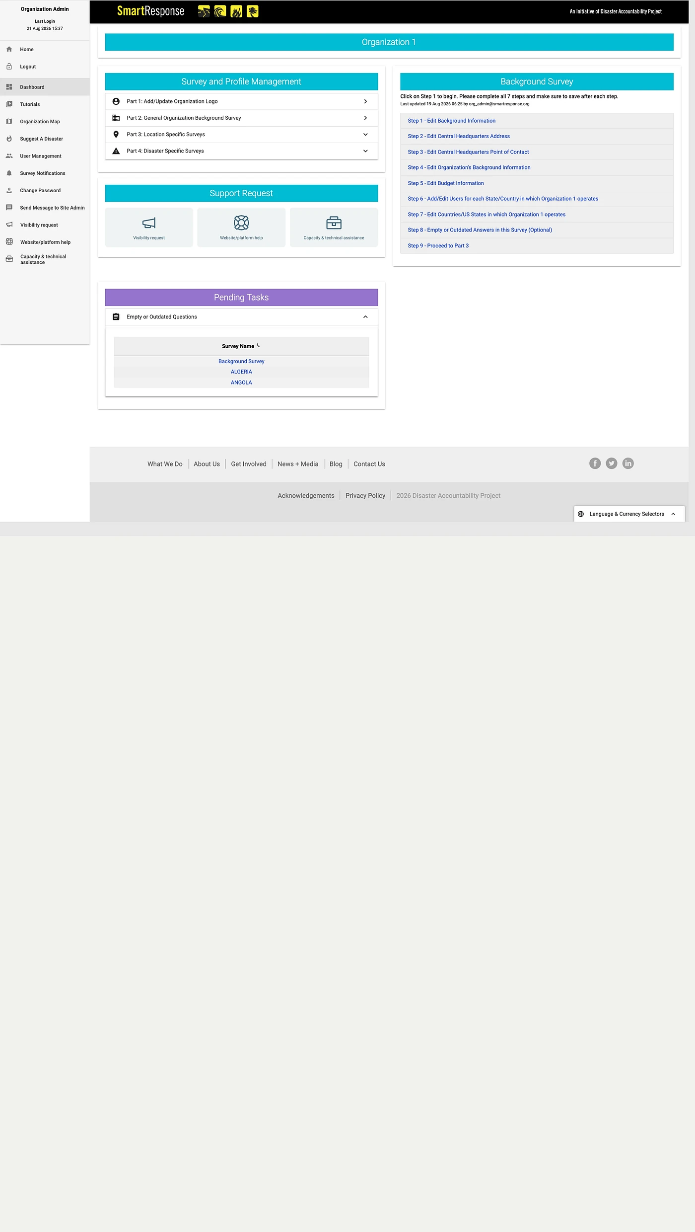
The dashboard reflected the system’s structure rather than the user’s workflow.
Instead of redesigning the interface immediately, I wanted to understand why onboarding felt difficult in the first place.
Before · The dashboard
-
System-driven information architecture
Users had to understand the platform’s Parts and Steps instead of simply following their tasks.
-
Fragmented progress visibility
Parts, steps, and pending tasks used separate systems with no clear overall status.
-
No clear next step
Too many competing actions made it hard to know what required attention first.
-
Critical tasks were buried
Support content and navigation competed visually with incomplete profile work.
The platform was being rebuilt from the ground up
Smart Response was being rebuilt on React, replacing a legacy stack of Angular, Java, and WordPress. The surveys were part of that migration, which is how a redesign brief came to exist at all.
Legacy
Modern
 Angular
 Java
Java WordPress
 React
React
Before · The survey
What made it complex
The survey combined over 10 input types, conditional branching, multiple sections, and sensitive organizational and financial information. Users had to understand what was being asked, determine what applied to them, and keep track of their progress across a demanding workflow.
- 10+ input types
- The survey used more than 10 input patterns, from simple selections to dates, percentages, repeating fields, and conditional inputs.
- Branching logic
- Answers could reveal different follow-up paths, creating a non-linear experience that users needed to navigate with confidence.
- Multi-step survey
- Users had to move through multiple sections and keep track of progress, which required clear wayfinding and persistent orientation cues.
- Sensitive information
- Questions included financial and organizational details that required extra care, trust signals, and confidence from users.
03 Research
Five sources, because no single one was enough
I combined interviews, surveys, stakeholder knowledge, workflow workshops, and audits to understand how nonprofit organizations completed onboarding.
-
Interviews
What it surfaced
- Mobile-first
- Connectivity
- Digital access
- Mental model
-
Surveys
What it surfaced
- Completion friction
- Repeated input
- Unclear progress
- Input effort
-

Stakeholder knowledge
What it surfaced
- Required data
- Data quality
- Product constraints
- Completion vs. data needs
-
Workflow workshops
What it surfaced
- Journey gaps
- Starting point
- Progress visibility
- Next-step clarity
-
Product and workflow audits
What it surfaced
- Cognitive load
- Modal scrolling
- Error prevention
- Missing confirmation
- Data reentry
Although external interviews were limited, combining multiple sources of evidence revealed four consistent themes.
-
Mobile-first usage
Design for mobile-first interactions.
-
Unreliable connectivity
Keep interactions lightweight and resilient.
-
Limited digital infrastructure
Avoid assumptions such as banking access or official websites.
-
Unclear mental model
Users needed guidance more than shorter forms.
04 The Reframe
Research reframed the problem
Research showed that the main barrier wasn’t the difficulty of individual questions. Users struggled to understand what needed attention, what was already complete, and where to continue.
-
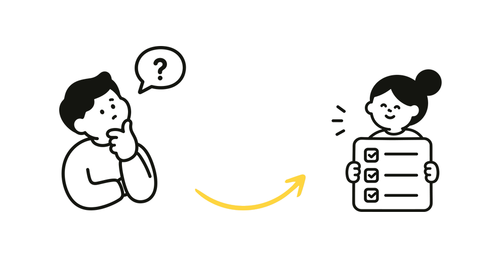
Initial
Too many questions
Reframed
Unclear priorities
Why it changed
Why it changed
Reducing questions alone wouldn’t solve completion. Users first needed clarity on what required attention.
-
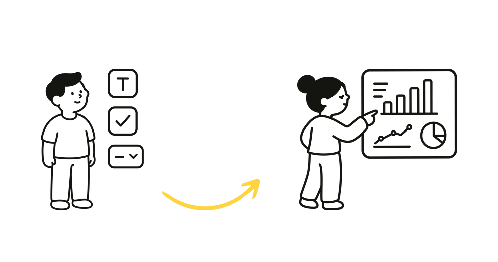
Initial
Multiple input types
Reframed
Overall progress
Why it changed
Why it changed
Users could see the current step, but not how it fit into the larger onboarding workflow or how much work remained overall.
-
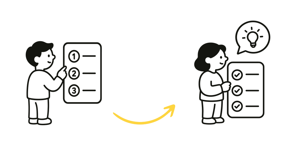
Initial
Multi-step surveys
Reframed
Next-step clarity
Why it changed
Why it changed
Users needed a clearer path through the workflow, including what to do next and where to resume.
Rather than redesigning the surveys in isolation, I proposed reframing the project around the entire onboarding workflow. The scope expanded from redesigning three forms to redesigning the dashboard, information architecture, and survey experience as one connected system.
- 1 Original scope
- 2 Research reframed the problem
- 3 Expanded scope
- General Organization Survey
- Location-Specific Survey
- Disaster-Specific Survey
Redesign three forms
The issue wasn’t isolated to individual forms.
- DashboardClarify what needs attention
- Information ArchitectureOrganize content around user tasks
- Survey ExperienceMake completion easier and more manageable
One connected onboarding workflow
05 The Redesign
From fragmented forms to a guided onboarding workflow
The redesign turned separate forms into one guided workflow. Because much of the required information could not be removed, the focus shifted to organizing complexity, surfacing what needed attention, and revealing only what was relevant.
-
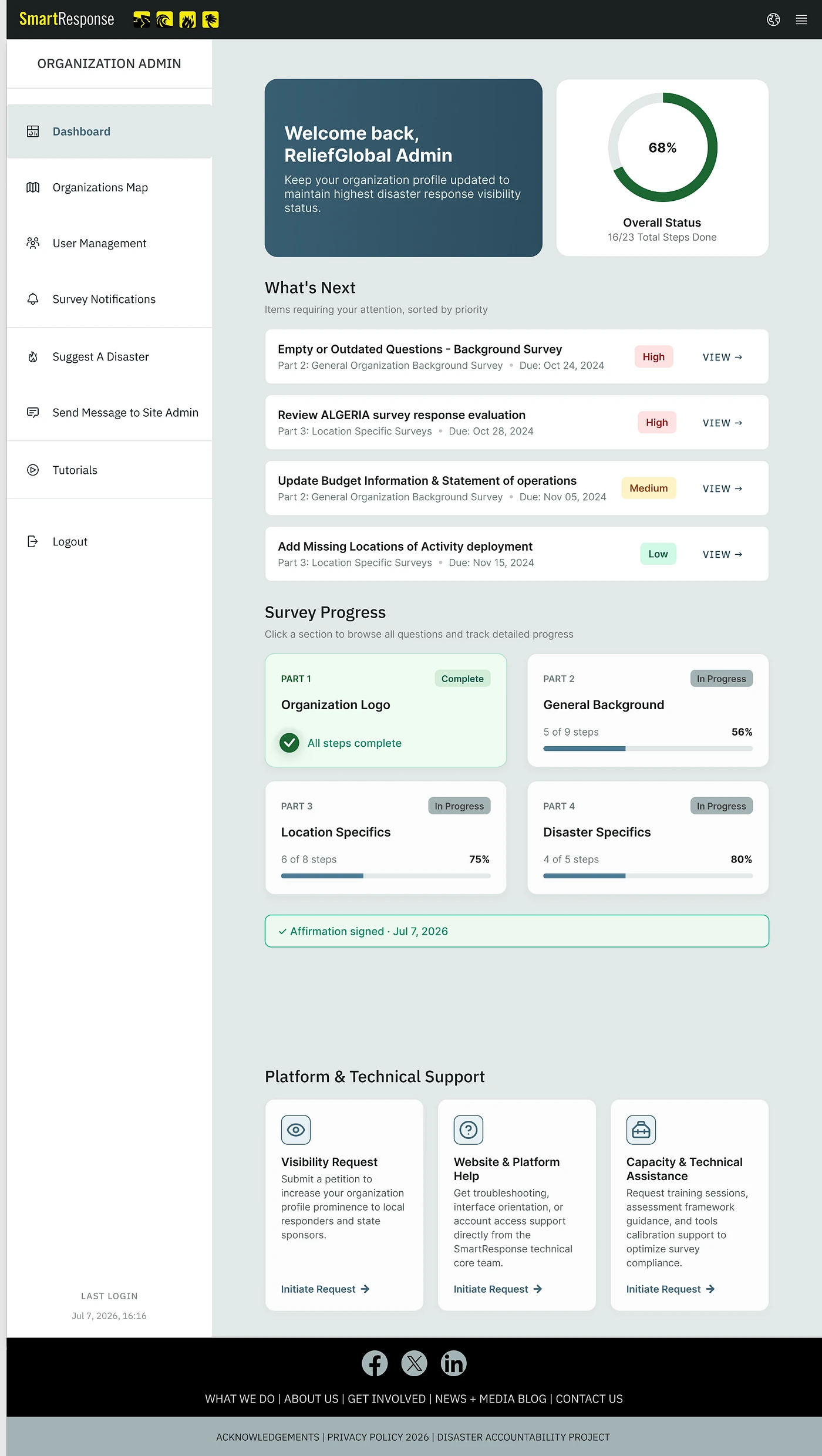
01
Dashboard
Incomplete work, overall status, and the most relevant next action, in one view.
-
02
What needs attention
What the old dashboard buried, surfaced first: what is unfinished and what to do about it.
-
03
Relevant survey
Conditional paths drop the questions that do not apply, so only what a user’s answers make necessary is asked.
-
04
Review
A review step before submission.
-
05
Confirmation
The submission is acknowledged, which the old flow never did.
Four principles the redesign is built on
Each one is a goal rather than a feature. The survey structure, the field-level decisions, and everything that was cut were all judged against them.
-
01
Orient before action
The dashboard became the starting point for the workflow, surfacing incomplete work, overall status, and the most relevant next action.
-
02
Structure the complexity
Related information was reorganized into predictable sections, while progressive disclosure reduced the amount of information users needed to process at one time.
-
03
Keep progress visible
Clear section states, completion cues, and save-and-return behavior helped users understand what was finished, what remained, and where to continue.
-
04
Reveal only what’s relevant
Conditional paths removed irrelevant questions and exposed additional complexity only when a user’s previous answers made it necessary.
Designing for real-world constraints
Research showed that reducing typing mattered more than reducing clicks. The decisions below show how that principle shaped field-level design under real product and engineering constraints.
Before
- Requires more manual input
- Spelling and phrasing vary
- More time to enter and review
After
- Find and select quickly
- Standardized, cleaner entries
- Add custom types when needed
Selection replaced typing wherever a list could answer the question. The free-text box stayed for everything the lists could not cover.
Before
- Manual country code entry
- Unclear formatting expectations
- Higher input effort and error risk
After
- Selectable country code
- Clearer, structured phone format
- Faster, more reliable global input
The new field is visually more structured, but easier to use. I initially explored a full international phone component with live formatting and country-specific validation. With Product and Engineering, I cut it to the smallest useful version: a country selector plus a clear format cue. It reduced ambiguity without adding a heavy validation library.
Reference pattern
- Twelve inputs per entry
- Repeated for every past response
- A component to build, test and maintain
What shipped
Step 2 · Activity Scope
Summarize your organization’s past work in the impacted areas (max 600 characters).
0 / 600 characters
Type into the field. It behaves as the built one does.
- One field, one stated limit
- Nothing new to load or maintain
- Free text, so nothing is excluded
The builder was cut to a single field with a stated limit. The counter warns when you pass it instead of blocking the keystroke, so nothing typed on a slow connection gets lost.
06 Impact
Usability testing with five nonprofit participants
The first three figures come from moderated sessions with five participants, so they point in a direction rather than settle one. The last is from the three-month pre-marketing period after partial rollout, and because other initiatives were running in parallel I read it as supporting evidence rather than a direct design attribution.
-
~26%
Higher survey completion.
-
~15%
Faster task completion.
-
Faster
Identification of unfinished work.
-
~2×
Donation activity against the previous baseline.
- Who Five nonprofit contacts, the people who actually maintain their organization’s profile, recruited at a sector conference.
- How One moderated hour each, facilitator and scribe, every stage time-boxed. Participants could answer in their own language.
- On what Clickable prototypes of the General Organization and Location-Specific surveys, and of the handoff between them. Six tasks in all, including registering an organization from scratch.
- Measured Whether each task was completed, how many attempts it took, how long it took, and every question asked of the facilitator.
07 Beyond the Metrics
The part that outlived the project
Beyond the product itself, I audited the shared design system, removed outdated components, and introduced reusable onboarding patterns for future work.
08 Reflection
-
What I’d do differently
Invest in deeper longitudinal user research
With more time and access, I would have followed nonprofit users beyond usability testing to understand how they returned to incomplete work, maintained profiles over time, and responded during active disaster situations.
-
What I’d do differently
Validate the redesign with longer-term product data
Usability testing gave us strong directional signals, but I would have established clearer post-launch benchmarks for completion, abandonment, return behavior, and profile quality to better separate design impact from other product initiatives.
-
Personal learning
Simpler doesn’t always mean fewer steps
This project changed how I think about simplification. Adding a step, confirmation, or decision point can make a workflow feel easier when it reduces cognitive load and makes the next action clearer.
-
Personal learning
Reframe the workflow, not just the interface
The biggest improvement came from looking beyond the surveys themselves. Redesigning the dashboard, information architecture, and survey flow as one connected system helped solve the underlying problem rather than simply polishing individual forms.
The clearest workflow isn’t always the shortest one.