
BuildDirect
Reframing the E-commerce Storefront Around Professional Buyers
A rebrand and a platform migration arrived with a one-line brief: “we need a better digital storefront.” Answering who “better” was for turned a visual redesign into a buying experience built for contractors, builders and designers.
01 At a Glance
- Role
- Senior Product Designer
- Platform
- Flooring & building materials, B2C and B2B
- Scope
- Product strategy · Research · Information architecture · End-to-end UX · Usability testing · Launch & iteration
- Team
- Product · Engineering · Marketing · Sales · Category Management · Customer Service · Operations
- Outcome
- +15% conversion rate
- −35% cart abandonment
- 50%+ faster page loads
Before-and-after analytics across a launch that also carried a rebrand and a re-platform. Read as a signal, not as an isolated result.
Overview
BuildDirect sells flooring and building materials to individual consumers and to professional buyers. As the company rebranded and migrated its e-commerce platform, the brief was one sentence: we need a better digital storefront.
“Better” meant something different to every team. I brought customer behaviour, sales insight and business priorities together to answer a more basic question first: who should the storefront optimise for? The answer moved the project from a broad visual refresh to an experience built around professional buyers, the frequent, high-value customers who needed to find, evaluate and buy materials quickly.
02 The Challenge
A storefront that had grown without a primary customer
The redesign ran alongside several business changes at once. The company was rebranding, migrating to a new technical platform, and narrowing its portfolio toward flooring, tile, carpet, decking and related building materials.
The storefront itself had evolved without a clearly defined primary customer. It served everyone from a homeowner making a one-time purchase to a contractor ordering several times a month.
Before · Browsing and deciding
Before · Checkout
Improving the experience for all of them equally kept making the problem broader. So before redesigning screens, I went after a more strategic question: who were we actually designing for?
03 The Reframe
Better — for whom?
With limited access to direct customer research, I combined Google Analytics, sales data, Hotjar, internal interviews and competitive analysis to understand who relied on the storefront and what they needed.
- Google Analytics
- Who arrived, what they looked at, and where they stopped.
- Sales data
- Three years of orders, which is what settled the question of who the business actually ran on.
- Hotjar
- Scroll and engagement behaviour on the pages customers used to decide.
- Internal interviews
- Sales and Category Management, who spoke to these customers every day.
- Competitive analysis
- How mature retailers in the category treated professional and consumer customers.
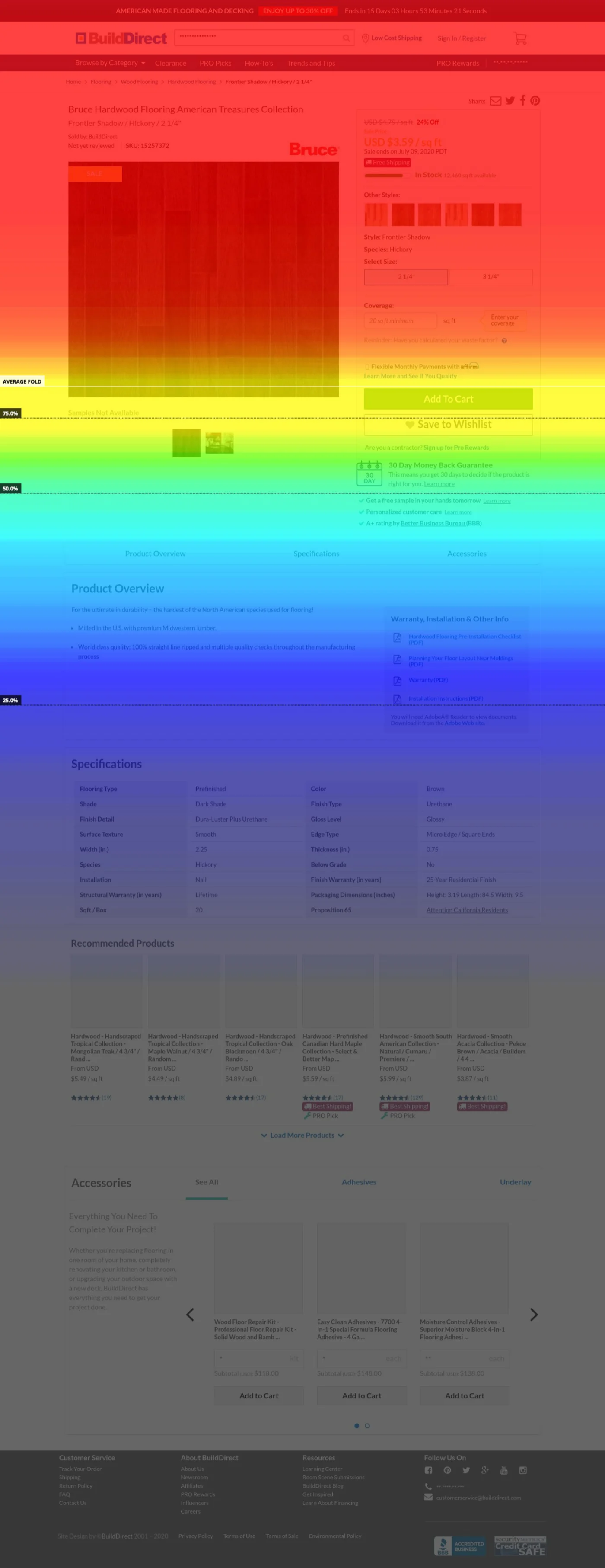
- Images, price, size and colour100%
- Add to cart, order a sample75%
- Average fold
- Guarantees and trust marks50%
- Product Overview<30%
- Specifications12–16%
- Accessoriespast the last marker
More than 70% of visitors never reached the core product information. Read off the map above, which prints its markers at 75, 50 and 25 per cent and stops there — so Accessories, which sits well below the last of them, has a bound rather than a figure. Sales heard the other half of it: customers rang who had never scrolled as far as the specifications or the accessories.
What customers were asking Support
The same request kept arriving in the support inbox, and it was for something the site already offered.
Real conversations from the support inbox. Turn a card over to see the message it was taken from; names are redacted.
One segment stood out. Across three years, professional buyers never accounted for less than 63% of total sales, rising to 91.6% in the strongest year. They were also a meaningful share of site traffic, and where a consumer buys once, a Pro buyer came back several times a month.
-
63%
of sales in the weakest of three years
-
91.6%
of sales in the strongest
A homeowner might buy flooring once, for one renovation. Contractors, developers and designers came back several times a month for active projects, and sales interviews said the same thing: Pro buyers were the company’s most frequent and most valuable customers.
They also shopped differently. Rather than browsing for inspiration, they usually knew what they needed and wanted to find the right product, confirm it met the project’s requirements, and buy it.
That gave us a direction: prioritise the customers who drove the majority of the business and used the storefront most often.
Making a strategic choice
Competitive research put most of the category on one side of that question: six of the eleven retailers here run one storefront with a Pro layer on top, and only two run a genuinely separate Pro site. We could have built the second storefront, but two would have needed their own development, merchandising, content and operational support, and the business was under pressure to focus investment and improve profitability.
On the customer and business evidence, we made a cross-functional decision: optimise the primary experience for professional buyers while keeping it usable for individual consumers. My part was to bring the behavioural and research evidence into the room, make the difference in Pro buyers’ needs concrete, and turn that into product priorities with Product, Sales, Marketing, Category Management, Engineering and leadership.
That gave us a much clearer definition of better.
Help our highest-value customers find, evaluate and purchase building materials faster and with greater confidence.
04 The Redesign
Designing for professional purchasing
Two principles carried the work, and every decision across navigation, discovery, product detail, sampling, checkout and performance was judged against them.
-
01
Efficiency
Help experienced buyers find, evaluate and purchase materials with as little unnecessary effort as possible. These are people who already know what they want.
-
02
Transparency
Surface the information, costs and system feedback a customer needs to commit to a high-value order. A pallet of flooring is not an impulse purchase.
01 · Make the right product easier to find
Before · three passes to reach a product family
After · the families are the top level
The old navigation reflected an inconsistent internal taxonomy. Related products appeared under different categories, the terminology did not always match how customers described materials, and important distinctions were buried deep in the hierarchy. For a buyer who already knew what they needed, that meant searching for it anyway.
I worked with Category Managers to restructure navigation around clearer product families: vinyl, wood, laminate, decking and carpet.
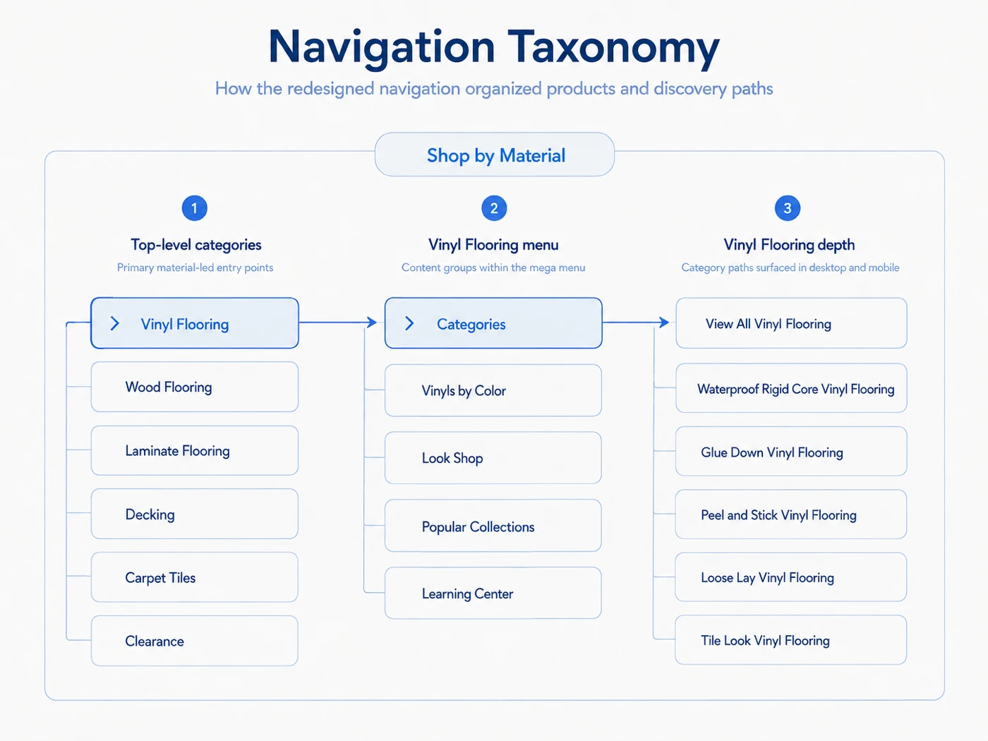
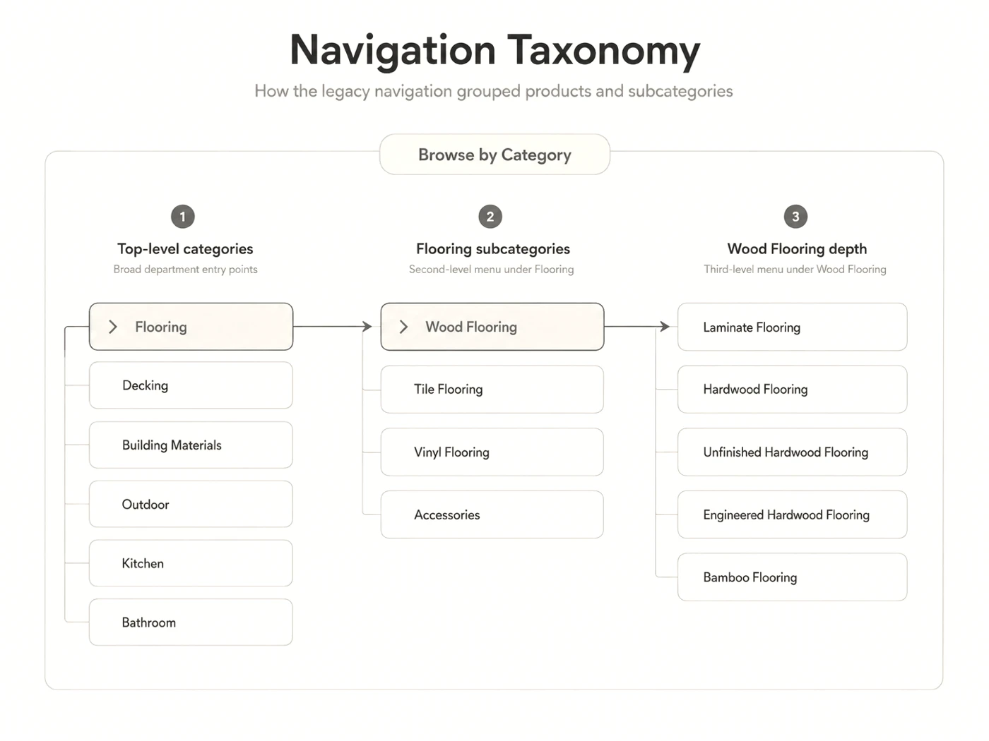
The hierarchy balanced three inputs.
-
1
Customer demand
Historical sales showed which categories customers reached for most.
-
2
Business priorities
Strategically important categories were given the visibility to match.
-
3
Domain expertise
Category Managers validated how professional buyers actually tell products apart.
We also surfaced distinctions such as rigid-core, glue-down and waterproof where they directly changed which product someone picked. The goal was never cleaner navigation on its own. It was to shorten the distance between “I know what I need” and “I found it”.
02 · Bring decision-critical information forward
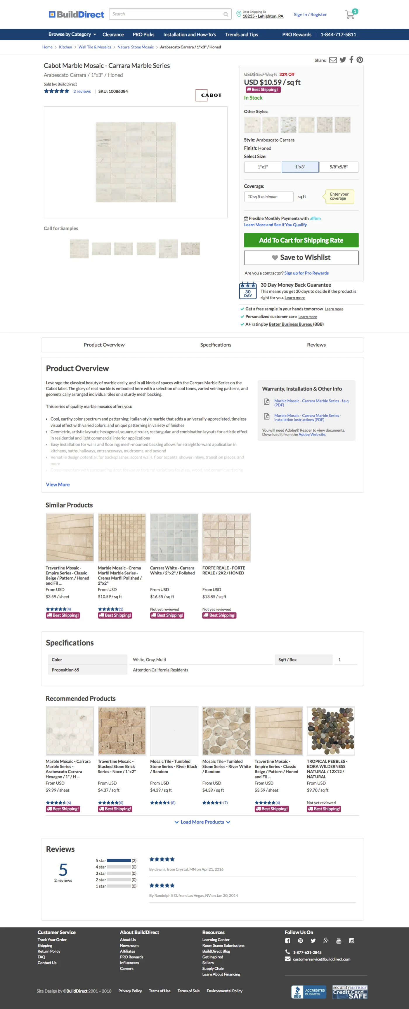
Hotjar showed engagement dropping sharply as customers moved down the old product page: under 30% reached the Product Overview and 12–16% the specifications, which sat near the bottom.
Google Analytics said the same thing about the end of the journey: of the sessions that reached checkout, about 95% did not complete an order.
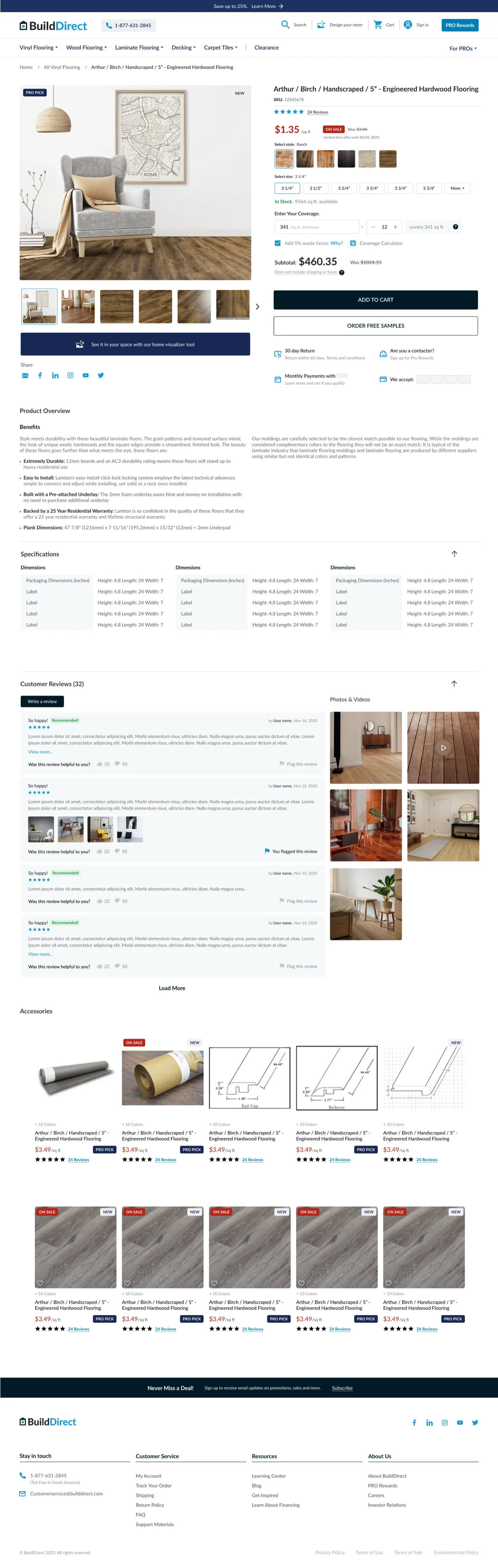
Sales interviews explained why that mattered: customers called Sales because they could not find the information they needed to make a decision. The scroll map and the funnel in the reframe are where those numbers come from. We reordered the page around what a professional buyer needs first.
- Gallery and buy boxtop of the page
- Product overview30% down
- Specifications40% down
- Customer reviews50% down
- Accessories74% down
- Recommended products87% down
Everything a buyer needs to decide with is now in the top half. Each band is as tall as that part of the page really is, measured off the capture above with the footer left out; blue is the product itself, grey is everything after it. The specifications were the fourth block on the old page, sitting between two rows of merchandising and starting about 68% of the way down.
We ranked what the page had to answer, in order: product imagery, price, size and variation options, material and colour, specifications, purchase actions, sample ordering. Less decision-critical metadata such as SKU and style was visually deprioritised. An earlier concept put the specifications inside accordions to satisfy stakeholder content requirements, and usability testing showed the extra interaction discouraged people from looking at all, so we surfaced the essentials directly instead.
If information is necessary to make a purchase decision, customers shouldn’t have to work to reveal it.
03 · Make sampling part of the purchase journey
For flooring, customers often need to see and feel a product before committing to a large order. BuildDirect already offered free samples, and the programme was so hard to find that some employees did not know it existed.
We moved sampling from a secondary feature to a core shopping action. Customers could request samples directly from the listing or product page, complete a sample order without creating an account, and tell free samples apart from paid products during checkout. The point was not feature visibility. It was to shorten the path between finding a product and being confident enough to buy it.
Sample ordering · on the listing page
Sample ordering · on the product page
The path to a free sample
05 Testing
Testing revealed a deeper problem
-
01
Internal walkthroughs
Realistic purchasing scenarios, run in-house first, to clear the obvious problems and our own blind spots before spending customer time.
-
02
Customer usability testing
Five existing customers, recruited with Sales and Marketing, in remote task-based sessions on Lookback. Checkout above all.
At first the issues looked unrelated. Users asked whether their sample had been added, whether it was actually free, where to find shipping information, and whether the order had gone through at all.
Nineteen of them, in four kinds — and underneath, one problem wearing four faces: customers did not trust what the system was doing.
Nineteen issues, in four kinds
-
System feedback & status
6 issues
- Order summary
- Shipping total
- Confirmation
- Status updates
-
Shipping clarity & transparency
6 issues
- Hidden options
- Unclear terminology
- Missing details
-
Validation & error prevention
5 issues
- Invalid inputs
- Inventory and weight errors
- Out-of-stock flags
-
Interaction & control
2 issues
- External navigation
- Nested scrolling
The four faces, and what customers said
-
Completion
Completion wasn’t clear.
Completion
- “Didn’t know if my order went through.”
-
Sample eligibility
Sample eligibility wasn’t visible.
Sample eligibility
- “Can I get the free sample?”
- “Similar products — which one has a sample?”
-
Fulfillment
Fulfillment lacked transparency.
Fulfillment
- “What is the provided pickup date?”
- “Why does it show the city and province if I can’t change or select it?”
-
Next steps
Next steps weren’t clear.
Next steps
- “What’s next?”
- Observed Users did not realise they had to enter square footage before adding to cart.
From individual fixes to confidence-first checkout
Rather than closing each comment as its own usability ticket, I framed the next iteration around a single principle: confidence-first checkout.
We added clearer sample confirmation, separated free samples from paid products, surfaced shipping and costs earlier, clarified the line-item breakdown, and made the order summary and progress feedback persistent.
Clear on what I added
Before
After
Clear on what I’ll pay
Before
After
Clear on where I am
Before
After
For a high-value building-materials order, transparency was not simply helpful information. It was the thing that let a customer move forward.
06 Constraints
Designing within real constraints
The redesign ran during a platform migration, while the existing business still had to keep trading. Design saw a chance to improve the shopping experience meaningfully; Engineering’s immediate priority was a platform stable enough to launch on.
We could not build the ideal experience at once. Richer product specifications and filtering would have improved discovery, and the engineering investment was too high against available capacity, so those improvements were deferred. We prioritised the core purchase journey, platform stability, and the changes that delivered the most customer value without putting the migration date at risk.
What we took on, and what we deferred
Treating performance as UX
One constraint could not be deferred: page speed. Competitive analysis showed other flooring storefronts loading three to four times faster — Lowe’s at a speed index of 3.2 and Home Depot at 4.4, against 13.8 here — and the investigation pointed at product imagery.
Category Managers uploaded merchandising assets straight into the catalogue, and the system let large original files reach the storefront unoptimised. That is a workflow problem as much as a technical one, so we addressed both: automatic image compression with Engineering, and image guidelines I wrote for Category Managers so assets arrived consistent in the first place.
Together those changes contributed a 50%+ improvement in page-load performance without a much larger performance programme. Sometimes improving the customer experience means fixing the system under the interface.
Where the time was going
The workflow, not just the files
Designing across teams
The work needed Sales, Category Management, Engineering, Marketing, Product and leadership. My role was to hold the customer, business and technical views in one place and turn them into a coherent experience.
07 Impact
What changed after launch
The redesign launched alongside the re-platforming and the rebrand, so these results cannot be attributed to the UX changes alone. They are before-and-after business indicators from post-launch Google Analytics rather than the output of a controlled experiment. I read them as one signal that the overall experience moved in the right direction.
-
+15%
Conversion rate, before launch against after.
-
−35%
Cart abandonment, over the same period.
-
50%+
Faster page loads, after the re-platforming.
Qualitative feedback pointed at a second shift. After launch Sales reported fewer questions about navigating the site or placing standard orders, and more conversations where their product expertise could add value. The goal was never to remove Sales from the journey. It was to let the storefront handle standard purchasing so Sales could spend their time where it counted.
Post-launch sales feedback · where Sales added more value
The redesign became a starting point
Launch was not the end of the project. With the new platform live, I kept working with Marketing, Category Management and Engineering on what the live site taught us.
-
Product cards
Refined the information and badges a card carries.
-
Naming and content
Improved product naming and merchandising copy.
-
Free samples
Kept iterating on the flow that testing had reshaped.
-
Room visualiser
Improved discovery of the tool that previews flooring in a customer’s own space.
How the iterations ran
Product card refinement
Before
After
Filter panel refinement
Before
After
SEO banner refinement
Before
After
We also evolved the SEO banners and homepage merchandising so Marketing could run content without a developer. The redesign was a stronger foundation rather than a finished answer.
08 Reflection
-
Personal learning
Focus is a product decision
Trying to serve everyone equally dilutes the experience. Prioritising professional buyers gave us clearer product priorities and a stronger basis for making trade-offs, and it made the disagreements easier to settle because we were arguing about evidence rather than taste.
-
Personal learning
UX goes beyond the interface
Performance, platform constraints and internal workflows all shape the customer experience. The image-compression work and the guidelines for Category Managers moved page speed more than any screen I drew, and neither of them was a screen.